
A new perception-based chromaticity diagram is presented that forms the foundation for the CIE UCS diagram and is complementary to the object space based (and largely archaic) CIE (1931) diagram. It also underlies the CIE 1976 L*a*b* and L*u*v* perception-based spaces.
The following figure is presented here at reduced scale (resolution) to accommodate a browser. A larger scale version is available in Chapter 17 in the Download Files area reached from the Site navigation bar.
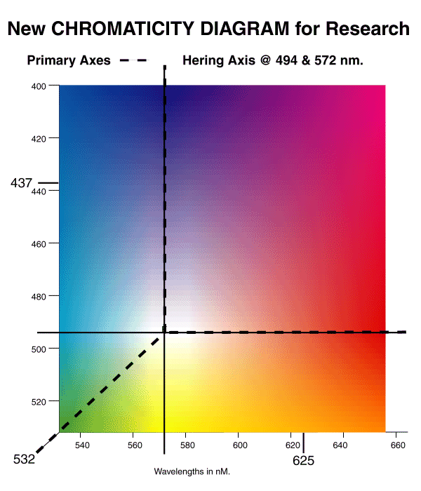
The NEW (perception-based) CHROMATICITY DIAGRAM FOR RESEARCH shown above provides a theory based replacement for the conventional object-space-based CIE Chromaticity Diagram.
This figure is orthogonal, conformal and equidistant. No artificial constructions, such as a "purple line" are used. The figure is based on the Theory presented in this work. The figure represents the perceived color of a scene or of a light source. For a scene viewed by reflected light, the original source is assumed to have a color temperature of 7053 Kelvin.
The most fundamental form of this figure plots the P and Q values of the chrominance channels of vision on the ordinate and abscissa respectively. However, the more illustrative form shown above has spectral wavelength as the scale on the axes.The figure is based on the fact the animal eye employs "subtractive color" as a fundamental principle in its evaluation of a scene. Under this principle, P = 0 occurs at a wavelength of 494 nm. Q = 0 occurs at a wavelength of 572 nm. For P = Q = 0, the eye perceives an achromatic scene. Under this condition, the intersection of the two coordinates defines the achromatic sensation, "white."
The fact that the spectral axis is bent sharply near 532 nm is a true mathematical reflection of the operation of the human visual system. Incident light between 400 and 532 nm is processed in the P chrominance channel of vision while light between 532 and 655 nm is processed in the Q chrominance channel.
When referred to object space, the New Chromaticity Diagram for Research is entirely orthogonal in quadrants 1,2 and 4. It is not orthogonal in quadrant 3. This is primarily due to the finite spectral width of the chromophores used in animal vision.
For narrow band (monochromatic) spectral sources, the color observed by the human eye is defined by the coordinates of this figure. Note the fact, obscured by most other presentations, that only two narrow band spectral sources are required to represent any arbitrary color in perceptual space.
If two wider band spectral sources are used, the perceived color reported by a human is described by the intersection of the mean wavelengths of the longer and shorter wavelength samples.
It is only necessary to use three arbitrary light sources to produce a specific color sensation if the lights used are non-spectral in character. The three selected light sources can only generate chromatic sensations within the triangle formed on this figure using the mean spectral wavelengths of each of these sources, resolved onto the two axes as suggested above.
Although the two axes shown are orthogonal as shown, the signals creating the P and Q signals are not. The M-channel signal appears as a component in each function. Because of this, it becomes difficult to define the axes in terms of the common wisdom. However, the figure is compatible with both the Young-Helmholtz (trichromatic) and Hering theories of vision when these theories are interpreted properly. As illustrated, the P=0 axis corresponds to one axis of the Hering theory. However, it cannot be defined as the red-green axis. It is a red-azure axis, where azure is defined as a narrowband light of mean wavelength equal to 494 nm. Similarly, the Q = 0 axis is the second Hering axis. However, it cannot be defined as the blue-yellow axis. It is more accurately defined as the purple-yellow axis where purple is defined as the sensation obtained when the signal in the P-channel is maximum and the signal in the Q-channel is equal to zero. The choice of purple or violet for the color to be associated with this terminus is primarily one of semantics.
The diagram can also be used to define a variety of primary axes in color space based on the trichromatic idea of Young-Helmoltz. The axes most strongly based theoretically are those shown by the dashed lines. The one axis begins beyond blue in the purple region defined as above and extends through white to the 532 nm point in the green. The other axis begins in the far red and also proceeds through white to the 532 nm point in the green. Traditionally, the CIE has found it difficult to define colors outside of the region bounded by straight lines between these three terminal points. This is because of difficulties with the conceptual framework used. The CIE diagram is based on the erroneous assumption that animal vision employs the additive color principle.
The figure is completely compatible with the Munsell Color System as shown in a separate COMBINED CHROMATICITY AND MUNSELL COLOR DIAGRAM.
Return to the website home page